Download Microsoft Power BI Data Analyst.PL-300.Dump4Pass.2024-10-12.179q.tqb
| Vendor: | Microsoft |
| Exam Code: | PL-300 |
| Exam Name: | Microsoft Power BI Data Analyst |
| Date: | Oct 12, 2024 |
| File Size: | 16 MB |
How to open VCEX files?
Files with VCEX extension can be opened by ProfExam Simulator.
Discount: 20%
Demo Questions
Question 1
You have a custom connector that returns ID, From, To, Subject, Body, and Has Attachments for every email sent during the past year. More than 10 million records are returned.
You build a report analyzing the internal networks of employees based on whom they send emails to.
You need to prevent report recipients from reading the analyzed emails. The solution must minimize the model size.
What should you do?
- Implement row-level security (RLS) so that the report recipients can only see results based on the emails they sent.
- Remove the Subject and Body columns during the import.
- From Model view, set the Subject and Body columns to Hidden.
Correct answer: B
Explanation:
Incorrect Answers: A, C: Does not reduce the size of the model. Incorrect Answers:
A, C: Does not reduce the size of the model.
Question 2
You import two Microsoft Excel tables named Customer and Address into Power Query. Customer contains the following columns:
- Customer ID
- Customer Name
- Phone
- Email Address
- Address ID
Address contains the following columns:
- Address ID
- Address Line 1
- Address Line 2
- City
- State/Region
- Country
- Postal Code
The Customer ID and Address ID columns represent unique rows.
You need to create a query that has one row per customer. Each row must contain City, State/Region, and Country for each customer.
What should you do?
- Merge the Customer and Address tables.
- Transpose the Customer and Address tables.
- Group the Customer and Address tables by the Address ID column.
- Append the Customer and Address tables.
Correct answer: A
Explanation:
There are two primary ways of combining queries: merging and appending. When you have one or more columns that you’d like to add to another query, you merge the queries. When you have additional rows of data that you’d like to add to an existing query, you append the query. Reference: https://docs.microsoft.com/en-us/power-bi/connect-data/desktop-shape-and-combine-data There are two primary ways of combining queries: merging and appending.
- When you have one or more columns that you’d like to add to another query, you merge the queries.
- When you have additional rows of data that you’d like to add to an existing query, you append the query.
Reference:
https://docs.microsoft.com/en-us/power-bi/connect-data/desktop-shape-and-combine-data
Question 3
You have a large dataset that contains more than 1 million rows. The table has a datetime column named Date.
You need to reduce the size of the data model without losing access to any data.
What should you do?
- Round the hour of the Date column tostartOfHour.
- Change the data type of the Date column toText.
- Trim the Datecolumn.
- Split the Date column into two columns, one that contains only the time and another that contains onlythe date.
Correct answer: D
Explanation:
We have to separate date & time tables. Also, we don’t need to put the time into the date table, because the time is repeated every day. Split your DateTime column into a separate date & time columns in fact table, so that you can join the date to the date table & the time to the time table. The time need to be converted to the nearest round minute or second so that every time in your data corresponds to a row in your time table. Reference: https://intellipaat.com/community/6461/how-to-include-time-in-date-hierarchy-in-power-bihttps://apexinsights.net/blog/top-5-tips-to-optimise-data-model We have to separate date & time tables. Also, we don’t need to put the time into the date table, because the time is repeated every day.
Split your DateTime column into a separate date & time columns in fact table, so that you can join the date to the date table & the time to the time table. The time need to be converted to the nearest round minute or second so that every time in your data corresponds to a row in your time table.
Reference:
https://intellipaat.com/community/6461/how-to-include-time-in-date-hierarchy-in-power-bi
https://apexinsights.net/blog/top-5-tips-to-optimise-data-model
Question 4
Note: This question is part of a series of questions that present the same scenario. Each question in the series contains a unique solution that might meet the stated goals. Some question sets might have more than one correct solution, while others might not have a correct solution.
After you answer a question in this section, you will NOT be able to return to it. As a result, these questions will not appear in the review screen.
You create a parameter named DataSourceExcelthat holds the file name and location of a Microsoft Excel data source.
You need to update the query to reference the parameter instead of multiple hard-coded copies of the location within each query definition.
Solution: In the Power Query M code, you replace references to the Excel file with DataSourceExcel. Does this meet the goal?
- Yes
- No
Correct answer: A
Explanation:
Instead modify the source step of the queries to use DataSourceExcelas the file path. Note: Parameterising a Data Source could be used in many different use cases. From connecting to different data sources defined in Query Parameters to load different combinations of columns. Reference: https://www.biinsight.com/power-bi-desktop-query-parameters-part-1/ Instead modify the source step of the queries to use DataSourceExcelas the file path.
Note: Parameterising a Data Source could be used in many different use cases. From connecting to different data sources defined in Query Parameters to load different combinations of columns.
Reference:
https://www.biinsight.com/power-bi-desktop-query-parameters-part-1/
Question 5
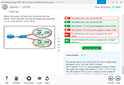
You have the data lineage shown in the following exhibit.

Use the drop-down menus to select the answer choice that completes each statement based on the information presented in the graphic.
NOTE: Each correct selection is worth one point.
Correct answer: To display the answer, ProfExam Simulator is required.
Explanation:
Box 1: CONTOSO BIKES report Box 2: three datasets Images, tweets and the Contoso datasets. Box 1: CONTOSO BIKES report
Box 2: three datasets Images, tweets and the Contoso datasets.
Question 6
You have files sales regions. Each region is assigned a single salesperson.
You have an imported dataset that has a dynamic row-level security (RLS) role named Sales. The Sales role filters sales transaction data by salesperson.
Salespeople must see only the data from their region.
You publish the dataset to powerbi.com, set RLS role membership, and distribute the dataset and related reports to the salespeople.
A salesperson reports that she believes she should see more data.
You need to verify what data the salesperson currently sees.
What should you do?
- Use the Test as role option to view data as the salesperson’s user account.
- Instruct the salesperson to open the report in Microsoft Power BI Desktop.
- Filter the data in the reports to match the intended logic in the filter on the sales transaction table.
- Use the Test as role option to view data as the Sales role.
Correct answer: A
Explanation:
Validate the roles within Power BI Desktop After you've created your roles, test the results of the roles within Power BI Desktop. From the Modeling tab, select View as. The View as roles window appears, where you see the roles you've created. Select a role you created, and then select OK to apply that role. The report renders the data relevant for that role. You can also select Other user and supply a given user. Select OK. The report renders based on what that user can see. Reference: https://docs.microsoft.com/en-us/power-bi/admin/service-admin-rls Validate the roles within Power BI Desktop
After you've created your roles, test the results of the roles within Power BI Desktop.
From the Modeling tab, select View as.

The View as roles window appears, where you see the roles you've created.

Select a role you created, and then select OK to apply that role.
The report renders the data relevant for that role.
You can also select Other user and supply a given user.

Select OK.
The report renders based on what that user can see.
Reference:
https://docs.microsoft.com/en-us/power-bi/admin/service-admin-rls
Question 7
You have a report that contains a bar chart and a column chart. The bar chart shows customer count by customer segment. The column chart shows sales by month.
You need to ensure that when a segment is selected in the bar chart, you see which portion of the total sales for the month belongs to the customer segment.
How should the visual interactions be set on the column chart when the bar chart is selected?
- noimpact
- highlight
- filter
Correct answer: B
Explanation:
Filters remove all but the data you want to focus on. Highlighting isn't filtering. It doesn't remove data, but instead highlights a subset of the visible data; the data that isn't highlighted remains visible but dimmed. Reference: https://docs.microsoft.com/en-us/power-bi/create-reports/service-reports-visual-interactions Filters remove all but the data you want to focus on. Highlighting isn't filtering. It doesn't remove data, but instead highlights a subset of the visible data; the data that isn't highlighted remains visible but dimmed.
Reference:
https://docs.microsoft.com/en-us/power-bi/create-reports/service-reports-visual-interactions
Question 8
You are using existing reports to build a dashboard that will be viewed frequently in portrait mode on mobile phones.
You need to build the dashboard.
Which four actions should you perform in sequence? To answer, move the appropriate actions from the list of actions to the answer area and arrange them in the correct order.
Correct answer: To display the answer, ProfExam Simulator is required.
Explanation:
In Power bi service you can optimize your power bi dashboard for mobile in 4 steps: Pin the items from the reports to the dashboard. Open the dashboard. Change the dashboard view to Phone view. Rearrange, resize or remove the items from the phone view. Confirm Reference: https://devoworx.net/power-bi-dashboard-for-mobile/ In Power bi service you can optimize your power bi dashboard for mobile in 4 steps:
- Pin the items from the reports to the dashboard.
- Open the dashboard.
- Change the dashboard view to Phone view.
- Rearrange, resize or remove the items from the phone view.
Confirm
Reference:
https://devoworx.net/power-bi-dashboard-for-mobile/
Question 9
You have a dataset named Pens that contains the following columns:
- Unit Price
- Quantity Ordered
You need to create a visualization that shows the relationship between Unit Price and Quantity Ordered. The solution must highlight orders that have a similar unit price and ordered quantity.
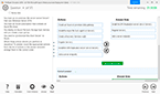
Which type of visualization and which feature should you use? To answer, select the appropriate options in the answer area.
NOTE: Each correct selection is worth one point.
Correct answer: To display the answer, ProfExam Simulator is required.
Explanation:
Box 1: A scatter plot... A scatter chart always has two value axes to show: one set of numerical data along a horizontal axis and another set of numerical values along a vertical axis. The chart displays points at the intersection of an x and y numerical value, combining these values into single data points. Power BI may distribute these data points evenly or unevenly across the horizontal axis. It depends on the data the chart represents. Box 2: Automatically find clusters Scatter charts are a great choice to show patterns in large sets of data, for example by showing linear or non-linear trends, clusters, and outliers. Reference: https://docs.microsoft.com/en-us/power-bi/visuals/power-bi-visualization-scatter Box 1: A scatter plot...
A scatter chart always has two value axes to show: one set of numerical data along a horizontal axis and another set of numerical values along a vertical axis. The chart displays points at the intersection of an x and y numerical value, combining these values into single data points. Power BI may distribute these data points evenly or unevenly across the horizontal axis. It depends on the data the chart represents.
Box 2: Automatically find clusters
Scatter charts are a great choice to show patterns in large sets of data, for example by showing linear or non-linear trends, clusters, and outliers.
Reference:
https://docs.microsoft.com/en-us/power-bi/visuals/power-bi-visualization-scatter
Question 10
Note: This question is part of a series of questions that present the same scenario. Each question in the series contains a unique solution that might meet the stated goals. Some question sets might have more than one correct solution, while others might not have a correct solution.
After you answer a question in this scenario, you will NOT be able to return to it. As a result, these questions will not appear in the review screen.
You have several reports and dashboards in a workspace.
You need to grant all organizational users read access to a dashboard and several reports.
Solution: You publish an app to the entire organization.
Does this meet the goal?
- Yes
- No
Correct answer: A
Explanation:
Instead assign all the users the Viewer role to the workspace. Note: The Viewer role gives a read-only experience to its users. They can view dashboards, reports, or workbooks in the workspace, but can’t browse the datasets or dataflows. Use the Viewer role wherever you would previously use a classic workspace set to “Members can only view Power BI content”. Reference: https://powerbi.microsoft.com/en-us/blog/announcing-the-new-viewer-role-for-power-bi-workspaces/ Instead assign all the users the Viewer role to the workspace.
Note: The Viewer role gives a read-only experience to its users. They can view dashboards, reports, or workbooks in the workspace, but can’t browse the datasets or dataflows. Use the Viewer role wherever you would previously use a classic workspace set to “Members can only view Power BI content”.
Reference:
https://powerbi.microsoft.com/en-us/blog/announcing-the-new-viewer-role-for-power-bi-workspaces/
HOW TO OPEN VCE FILES
Use VCE Exam Simulator to open VCE files
HOW TO OPEN VCEX AND EXAM FILES
Use ProfExam Simulator to open VCEX and EXAM files
ProfExam at a 20% markdown
You have the opportunity to purchase ProfExam at a 20% reduced price
Get Now!